Once upon a time, I was a teacher at the university with a bunch of students learning both web and graphic design. They usually wanted to launch Illustrator, Photoshop or Dreamweaver and start designing the project they had in their minds. Wrong.
I always used to tell them about how important is the first step after having a good idea: to make a sketch with paper and pencil. No colours needed at this stage.
This is specially important for a web designer. And sometimes we forget this because of deadlines. And here’s the first advice by my side: never miss this first mandatory step or prepare to waste a lot of time later with corrections…

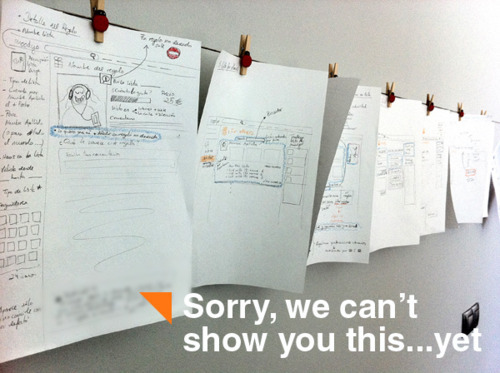
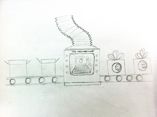
We sketched almost every page of the new Moodyo site. Alex, Rui and myself joined around a table for days and we discussed about what was right or wrong (in our opinion…) for usability, ease of use, etcetera. I also designed the first drafts of the “MooMachine”, that big machine in our public home page that virtually shows the activity inside Moodyo. Another useful tip is to use colors to give different priorities to the different features. We used three levels: blue for “high”, green for “medium” and pink for “low”.

After we made all the drawings, we built all the vectors and bitmaps in Illustrator and Photoshop. We coloured the layouts and moved every pixel to its right place. And, of course, we changed the colour schema many times. But the basic structure it’s strong. There will be for sure some modifications in the next weeks but we have a path to follow.
Here I’ve attached some pictures showing the drawings we made in the first designing stages. Hope you like it.